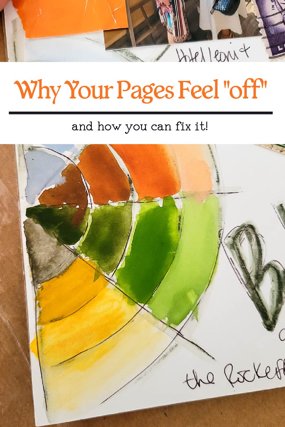
Why Your Pages Feel “Off”
How Better Color Choices Fix Everything
Every artist and journaler I know has had this moment. You finish a page, step back, and something about it just feels wrong. Not bad exactly. Just off. The elements are fine. The layout is fine. The technique is fine. But the page doesn’t look the way you imagined it would. It feels flat or chaotic or disconnected, and you can’t quite explain why.
Most people assume this is a skill issue or a lack of talent. They think they need better drawing skills, better handwriting, better collage pieces, better tools. But more often than not, the problem is much simpler.
Your colors are fighting each other.
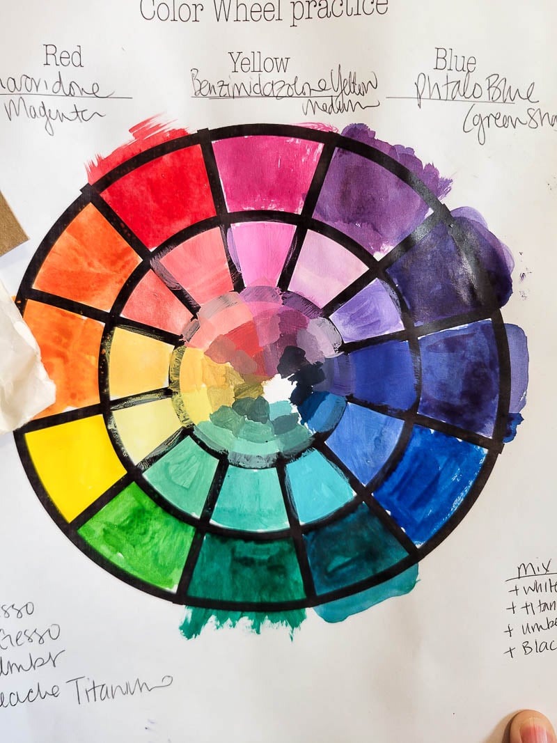
Color is one of the most powerful influences on whether a page feels harmonious or confusing, peaceful or loud, joyful or dull. And the truth is, most of us use color instinctively but not intentionally. We reach for whatever looks pretty in the moment. We mix palettes we like individually but not together. We layer colors without understanding how they interact. Then we wonder why the finished page doesn’t quite land.
The good news is that color can be fixed far easier than technique. When you start understanding why colors work, the entire feel of your pages shifts dramatically.
Here’s why your pages may feel off, and how better color choices create instant confidence and ease.
You might be using too many colors without realizing it
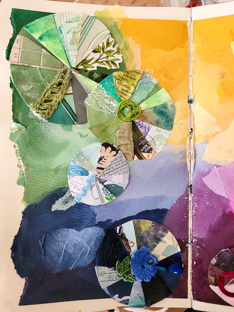
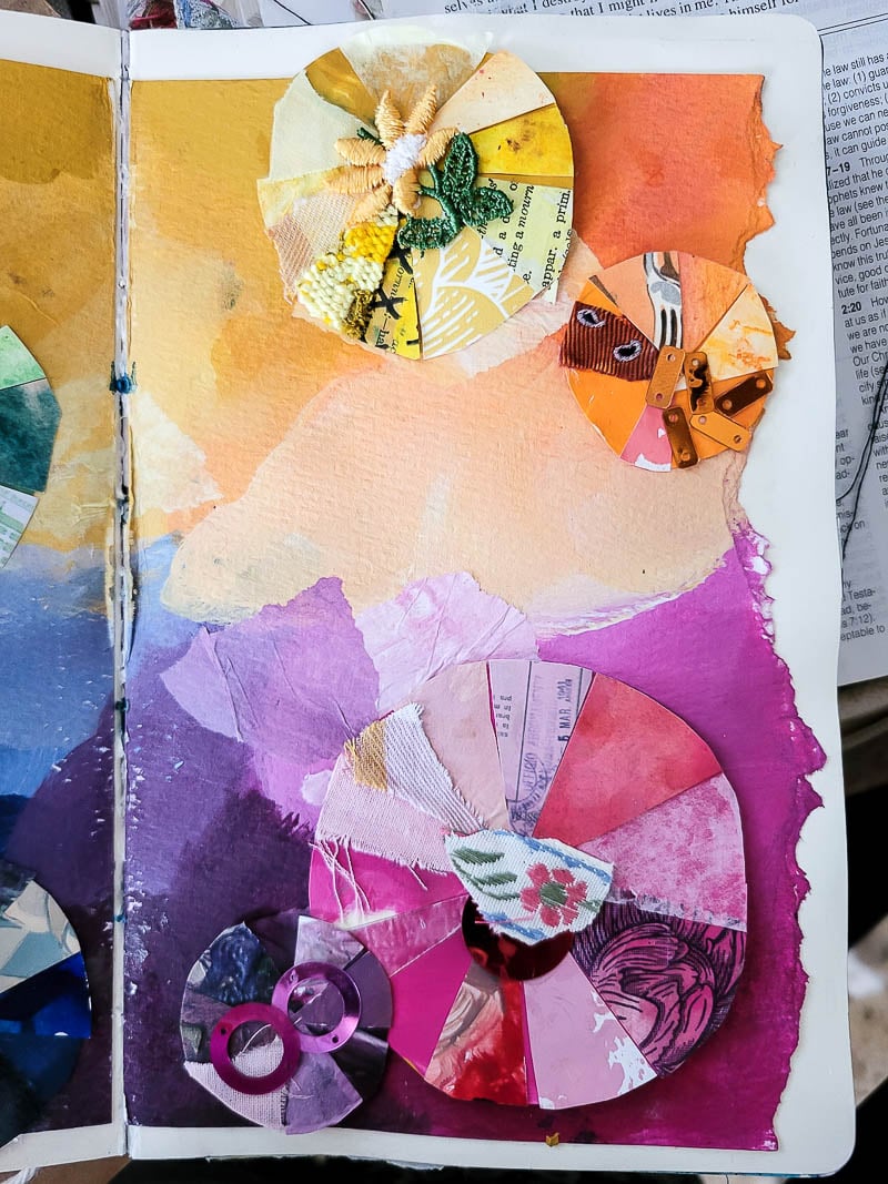
This is one of the most common reasons pages fall apart. Not because variety is bad, but because too much variety without relationship makes everything compete for attention. When everything shouts, nothing stands out.
Limiting your palette, even slightly, creates calm, intention, and cohesion. A small set of colors works together naturally. Your brain relaxes, and so does your page.
Some colors carry emotional weight you aren’t aware of
Every color has a feeling. Even if you don’t consciously know it, your eyes and brain respond to color emotionally. If your page feels tense when you wanted soothing, or bland when you wanted lively, it might be because your color choices are sending mixed signals.
A little color awareness helps you create pages that match the feeling you actually intended.
Colors may be competing instead of supporting each other
You’ve probably chosen a beautiful color combination more than once that somehow didn’t translate when you put it on the page. Sometimes colors work beautifully on their own but clash when placed together.
Understanding how colors relate keeps you from creating accidental tension or muddying your focal point. When colors support each other, everything looks more polished with almost no extra effort.
Your focal point may be getting lost in the background
Color directs attention before anything else. If your focal point has equal visual weight as your background or your accents, the eye doesn’t know where to land. This is one of the fastest ways pages start feeling messy or confusing.
Strategic color choices make your focal area clear, natural, and effortless. It becomes obvious where the viewer should look first.
You might still be guessing instead of choosing
Guessing creates doubt. Doubt kills confidence. When you understand color, even at a beginner level, you stop guessing. You stop second-guessing. You stop wondering whether your page will come together or collapse halfway through.
Instead, you start making simple choices that automatically work. That ease is everything.
Why learning color changes everything
When you understand how color works, you don’t actually spend more time deciding. You spend less. Suddenly you know why certain colors feel calm and others feel energetic. You know why some combinations work and others don’t. You know what to add when a page needs depth and what to remove when a page feels loud.
Color becomes a tool you can trust instead of something you hope for.
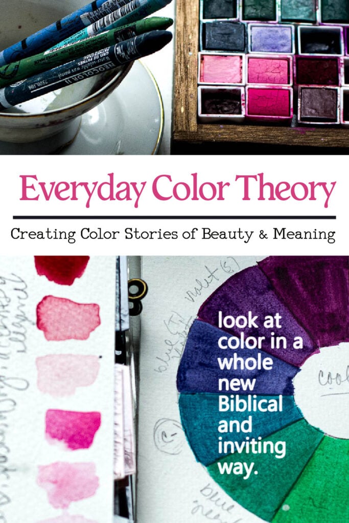
This is why I am so excited about the upcoming color theory course. Not because of the terminology or charts or technical rules. What excites me is the outcome. When you understand color, even a little, you create with more confidence, more ease, and more freedom. Your pages look more intentional even when you are playing. Your choices feel clearer. Your art becomes more enjoyable.
Color theory isn’t about learning rules. It is about learning why your colors work so you can lean into creativity without fear or frustration.
If your pages feel off sometimes, you are not doing anything wrong. You simply haven’t unlocked the part of creativity that makes everything else fall into place. Once you do, your art shifts in ways you can feel immediately. Join our STUNNING course – Everyday Color Theory for a fresh understanding on color, how it works and how to gain confidence in the palettes you use in your art, journal and projects.